In today’s competitive digital landscape, it is UI design that makes or breaks a product. Consistency is at the core of good UI design; it is a principle that ensures your product feels cohesive and intuitive. Whether it’s a website, app, or any other digital platform, maintaining consistency improves user experience, strengthens brand identity, and fosters trust. In this blog, we’ll explore why consistency is essential, dive into actionable tips to maintain it, and discuss its far-reaching impact on user trust and business success.
Why Consistency is Essential in UI

Consistency in UI design is more than just an aesthetic choice; it’s a cornerstone of usability. While users are interacting with a product, they form mental models-what should be expected from it, how things should work. Consistent design aligns with these models, helping users predict actions and navigate effortlessly.
A product that is not consistent makes users learn its interface over and over again. This leads to frustration and abandonment. A consistent design, however, creates familiarity and comfort, enabling users to focus on their goals, not on how the interface works. Consistent design also reinforces your brand image, making your product recognizable and reliable for users.
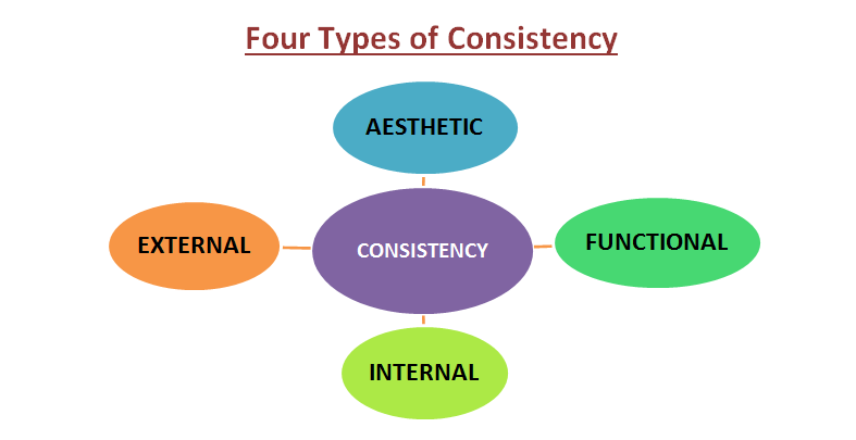
Types of Consistency in Design

Aesthetic Consistency
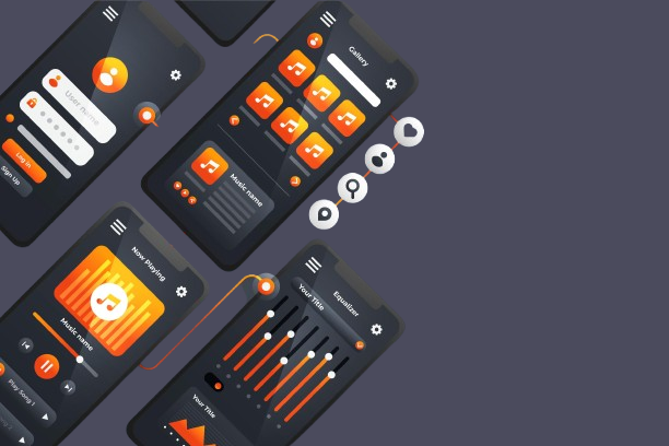
Visual consistency keeps the look of all of your elements in harmony. This means a consistent color palette, typography, iconography, and spacing set for your product. For example, buttons need to be of the same size, color, and font style on different pages. Visual consistency strengthens brand identity; consistency in looks implies professionalism and, therefore, trust to the user. It also creates an aesthetically pleasing experience, reducing distractions and helping users focus on the content or task at hand.
Functional Consistency
Functional consistency ensures that similar actions produce similar outcomes across your interface. For example, a “Save” button should always do the same thing whether it’s on a settings page or inside a form. This kind of consistency reduces the cognitive load on users since they don’t have to learn behaviors over again in different parts of the product. Functional consistency gives users confidence that can be frustrating if your functionality is unpredictable; thus, users might leave your product.
Internal Consistency
Internal consistency refers to maintaining uniformity within a single product or platform. This includes consistent layouts, navigation patterns, interaction styles, and content tone across all pages or features. For example, if your website uses a breadcrumb navigation on one page, it should appear on all other applicable pages. Internal consistency creates a seamless experience for users, enabling them to navigate effortlessly and understand the interface intuitively.
External Consistency
External consistency has to do with aligning your product against established conventions and user expectations shaped by other similar platforms. For instance, following design guidelines, such as Apple’s Human Interface Guidelines or Google’s Material Design, makes your product feel like home for users who have been working with those systems. External consistency is most important when it comes to cross-platform apps because users expect certain functionality and aesthetics regardless of the device they are operating. This kind of consistency reduces the learning curve and increases usability for a wide range of users.
Tips for Maintaining Consistent Design
- Develop a Comprehensive Design System
A design system is the single source of truth for keeping everything consistent across your product. It’s a collection of reusable components, style guides, and predefined rules for visual and functional elements. When the color schemes, typography, button styles, and interaction patterns are documented, it gives teams the confidence that everybody works from the same blueprint. A strong design system not only encourages consistency; it eases the collaboration between designers and developers, resulting in fewer mistakes and much less time used.
- Use a Limited and Harmonized Color Palette
 Colors really help establish visual identity. It is best practice to keep in mind, to choose a few colors, in order to really stay cohesive with your look. This would guarantee that buttons, background—everything, would be represented with just the exact shades of chosen colors. Having a well-set palette assures the accessibility—because it maintains contrast ratios necessary for good readability and the well-perceived visual appearance through users—and fortifies brand character, in general.
- Adopt a Grid System
A grid system provides a framework that helps to align content and keep elements spaced evenly, making layouts appear organized. Whether it be a website or an app, grids allow designers to maintain consistent proportions and margins across all screens. For example, in web design, a 12-column grid can be used to provide much flexibility while maintaining balance. Sticking to a grid system improves visual consistency and eases the development process, as developers can easily translate designs into code.
- Standardize Typography
 Standardization of typography will also involve the specification of font styles and sizes that would be used for various text elements, such as headings, subheadings, and body text. It will make your design look structured, clear, and readable. For example, headlines are usually in large, bold font, while paragraphs are in a much smaller but readable font size. The rules should also cover line spacing and letter spacing to make the UI uniform and prevent it from becoming cluttered, ensuring a polished and professional experience for users.
- Leverage Reusable Components
Reusable components are pre-designed elements that can be used across multiple pages or screens, such as a button, an input field, or a card layout. Building up a library of such components allows designers the ability to maintain consistency without having to start from the ground up with each new feature. This approach fast-tracks the development cycle while reducing inconsistencies. These can be efficiently managed and updated with tools like Figma and Adobe XD.
- Document Interaction Patterns
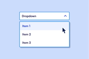
 Interaction patterns describe how things behave when users interact with them. For example, dropdown menus, hover effects, and animations should follow documented rules for consistency. The hover state of a button, for instance, should have the same color and effect across the product. When these patterns are clearly documented, everyone on the team applies the same behaviors in a predictable and seamless experience for users.
- Regularly Audit Your Design
Inconsistencies can creep in over time, either through adding new features or changes. In addition, regular design audits will help to identify such inconsistencies and make corrections where needed. Audits involve cross-referencing any live product against the design system for deviations. It also uncovers old components or styles that are in need of renewal. From time to time, auditing your design ensures it stays polished and cohesive and ensures that the user has an excellent experience.
- Encourage Cross-Team Collaboration
Consistency cannot be maintained without collaboration among designers, developers, and other stakeholders. Regular communication is important so that everyone understands the design system and how to follow it. This will also help in solving ambiguities, especially during the handoff from design to development. Encouraging feedback and alignment among teams ensures consistency in the design and implementation process and prevents misinterpretations or deviations.
How Consistency Impacts User Trust

Consistency plays a crucial role in the creation and reinforcement of user trust. If a design is consistent, users are more confident navigating through an interface because they encounter predictable patterns and behaviors. That predictability reassures them that they are in control, which reduces frustration and decreases the likelihood of errors. For instance, if a button’s behavior is the same on all pages, then users can trust their gut feeling and thus improve their general experience.
Consistency conveys professionalism and attention to detail. Well-aligned design with a coherent visual identity gives users the idea that the creators of this work have invested much time in delivering a perfect product, which builds trust and thus makes users trust the brand behind the product. Similarly, a consistent e-commerce website feels much more authentic, so users would hesitate less when proceeding with their transactions.
Moreover, consistency in language and tone throughout the interface strengthens the emotional connection with users. Whether it’s error messages, onboarding guides, or call-to-action buttons, a consistent voice conveys reliability and reduces confusion. Users are more inclined to trust an interface that speaks to them clearly and in a way they can understand.
When this consistency is compromised say, when the navigation or button behaviors change in unpredictable ways, the users start doubting the product’s reliability. A very basic trust erosion toward the brand might follow, which might even touch on questions of platform security. Designers thus make consistency a number-one priority for their users so that they can find the interface to be reliable, intuitive, and worthy of loyalty.
Advantages of Consistent Design
Enhances Usability
Consistent design makes an interface intuitive and thus easier to use. Users can spend less time figuring out how to interact with an interface when they encounter familiar patterns, such as a consistent navigation bar or predictable button placements. This reduces the learning curve and lets users focus on their tasks rather than deciphering the design. For instance, when the layout of a website is consistent in alignment and spacing, users can easily locate the most important features, making the experience smoother.
Strengthens Brand Identity
A consistent design confirms brand recognition by creating a consistent visual identity. The uniform application of colors, typography, logos, and imagery across all touchpoints will, therefore, make the user link those elements with your brand. For example, companies like Apple do this for all their products and marketing tools, so their brand can be easily recognized by many. Strong association breeds loyalty and trust, allowing customers to decide on your product or service over other similar businesses.
Boosts User Retention
 Users are more likely to return to a product or service that feels both familiar and reliable. A consistent design makes the user comfortable; users will easily feel at home interacting with your interface. It is this familiarity that breeds repeated interactions because users don’t need to relearn how to use the platform each time. For instance, a mobile app in which the same gestures for navigation are consistently used across updates maintains its usability, keeping users engaged over time.
Improves Development Efficiency
 Consistency is good for the users, but it’s also good for designers and developers. Having a design system and a reusable component library in place makes teams work more efficiently, as they don’t have to create new designs or code for every feature. A streamlined workflow will save development time and guarantee that updates or new features will match perfectly with the rest of the design. Also, developers can easily understand and implement the design, which reduces discrepancies between the design mockups and the final product.
Enhances Accessibility
Consistent design supports accessibility because it guarantees that all users, including users with disabilities, will not be confused while navigating the interface. For instance, a consistent heading structure, button size, and color contrast ratio between pages help users of assistive technologies know where they are in the layout. Accessibility guidelines are easier to implement when designs are standardized, making your product more usable by the largest number of people.
Builds User Trust and Loyalty
As already discussed, with the uniform design comes security and assurance the user feels confident with your product. People in the initial stages start relying on the platform to perform a job for them smoothly when design behaves consistently ensures a perfect transition. Then, people foster a particular level of reliance that ascertains one’s development of the rapport with his users over a long term and sometimes pushes them even harder to refer their products.
Common Challenges in Maintaining Consistency
While the benefits of consistent design are clear, it is hard to achieve, mainly in complex or large projects.
When several teams work on the same product, inconsistencies can’t be avoided, given different interpretations of the guidelines set out in the design. For example, developers can implement a button style differently from how it was designed, or marketers can create visuals that don’t conform to the branding established. In most cases, such lack of alignment is due to either poor communication or lack of understanding of the design system.
As new features are added over time, it becomes increasingly difficult to maintain consistency. Each feature may bring with it unique requirements or design elements that stray from the original system. If not well planned, these can add up, and the user experience becomes fragmented.
Clear, accessible documentation is required to support consistency. Unmaintained, or absent, guidelines leave team members making assumptions, or one-off solutions. These create inconsistencies in style. For example, without any reference point for typography rules, a product could use any number of different font styles in its many facets.
For overcoming such challenges, there needs to be a strong channel of communication between teams, regular updating and enforcement of documentation, and commitment to the integrity of the design system as the product evolves.
Conclusion
Consistency is the foundation for any good UI design and the bond between aesthetics and functionality. By creating a robust design system, sticking to the visual and interaction guides, and keeping the users’ feedback in mind, you can create a cohesive product that’s easy to use. Consistency not only ushers in usability but also builds trust and loyalty for your product, giving it an edge in this crowded market.
Remember, when working on your next design project, it is in the small and consistent details that lies the big magic for changing user experience and perception. Welcome consistency to see your product thrive in the hands of satisfied users.
