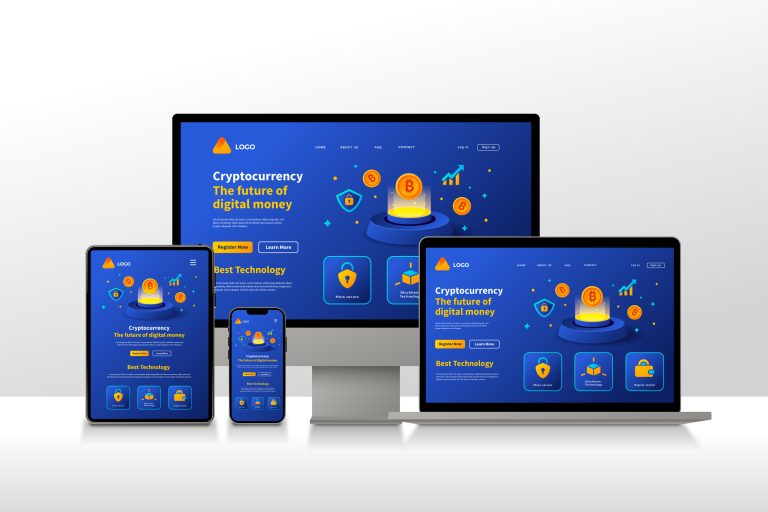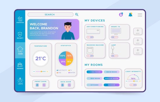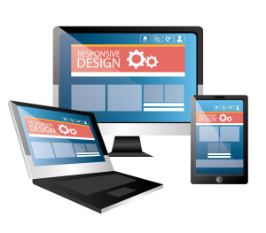
In today’s world, where technology has connected every dot of our lives, designing for various devices is not an option but an obligation. People access digital platforms through smartphones, desktops, tablets, smartwatches, and even TVs. Each device has its challenges, user expectations, and technical requirements. The goal for designers will be to provide an experience that transitions seamlessly across these devices and feels intuitive and engaging. In this blog, we go deep into the importance of responsive design, the nuances of mobile and desktop interfaces, and designing for a multi-device landscape.
The Importance of Responsive Design
Responsive design is a cornerstone of modern UI/UX development. It is the process of designing interfaces that can fluidly adapt to various screen sizes and resolutions, ensuring consistency in user experiences across all devices. For instance, a user might begin his journey in the morning on his smartphone and then continue it on his desktop at work, perhaps revisiting it on a tablet later in the evening. Responsive design ensures that the experience remains cohesive, no matter the device.
Responsive design is all about flexibility. Designers use techniques like fluid grid layouts, scalable images, and CSS media queries that make the content adaptable. A good example of a responsive website would dynamically reorganize elements on a text block that shrinks for smaller screens, images change their size, and navigation menus turn into hamburger icons for touch accessibility. This adaptability is not just a question of aesthetics but one of usability; users are more likely to use a system that does not force them into zooming, lots of scrolling, and erratic interactions.

Beyond usability, responsive design is a critical means of gaining search engine optimization. Search engines, notably Google, give precedence to mobile-friendly sites in their rankings. Therefore, a responsive approach offers enhanced user satisfaction and ensures better visibility in search results, driving traffic and conversions.
Key Differences Between Mobile and Desktop Design
Aspect | Mobile Design | Desktop Design |
Screen Size | Smaller screens, requiring simplified layouts and minimal content. | Larger screens allow for detailed layouts and multiple elements displayed simultaneously. |
| Input Method | Touch-based (fingers), with gestures like tapping, swiping, and pinching. | Mouse and keyboard inputs, enabling precise clicks and hover effects. |
Navigation | Compact menus, often hidden behind hamburger icons or collapsible sections. | Extensive menus with dropdowns, visible at all times. |
Content Priority | Focus on essential features and content for quick access. | Can include more detailed information and additional features. |
Performance | Optimized for slower networks, smaller file sizes, and faster loading speeds. | Can handle heavier content and higher-resolution media due to better hardware and network support. |
Visual Design | Larger buttons and touch-friendly spacing to accommodate finger taps. | Smaller, more precise elements optimized for mouse interaction. |
Screen Orientation | Vertical (portrait) orientation is dominant, though users may switch to horizontal (landscape). | Horizontal (landscape) orientation is the standard. |
User Context | Designed for on-the-go use, catering to shorter attention spans and quick tasks. | Designed for stationary use, allowing for longer, more in-depth interactions. |
Interactions | Prioritizes one-handed usability and straightforward interactions. | Enables multitasking with features like drag-and-drop and multi-window workflows. |
Design Elements | Simplified navigation bars, reduced text, and single-column layouts. | Detailed sidebars, multi-column layouts, and larger media elements. |
Testing Considerations | Must account for diverse devices and screen resolutions. | Focused on consistency across different desktop resolutions and browsers. |
Designing for Tablets

Tablets sit in a middle ground between mobile and desktop devices: their larger screens provide the opportunity for richer visuals and more complete layouts, while their portability demands designs remain touch-friendly. A good tablet interface strikes a balance—leveraging screen space to present more information without overwhelming the user.
Another important consideration when designing for tablets is orientation. Users frequently switch between portrait and landscape modes, and the design must adapt seamlessly to both. For instance, a productivity app on a tablet might be a single-column layout in portrait mode but expand into a multi-column interface in landscape mode to make effective use of the extra space. And features such as split-screen multitasking further differentiate tablets, offering opportunities for innovative design.
Multi-Device Testing
Testing is the backbone of multi-device design. With the vast amount of devices, operating systems, and browsers in use today, making sure that consistency and performance is there across all combinations can be no small feat. Tools like browser emulators, real-device testing labs, or automated testing platforms assist in finding potential issues.
Meanwhile, real-device testing provides particular insights into how designs function in real-world situations. Screen glare, touch sensitivity, and network speed may all have an impact on the user experience. Broad testing ensures not just usability but also the enhancement of accessibility in designs, enabling them to serve users with varied needs, including those who rely on assistive technologies.
The Evolution of Multi-Device Design
 Design has to continuously change with the landscape. And as technology continues to move into wearables, IoT, foldable screens, and other connected devices, it means designers have to adapt. Foldable devices will force designers to think beyond static layouts. On wearables, designers must distill ultra-simplified interfaces that communicate at times vital information that a user needs in one glance.
In that respect, designers will need to be modular and scalable with the developments. Designing by keeping future-proof in mind means allowing the interfaces to adapt to emerging technologies so as to remain relevant in an ever-changing digital ecosystem.
Conclusion
This is both art and science, each requiring a deep understanding of users’ behaviors, the capabilities of various devices, and design principles to carve out an interface that feels natural and intuitive. Whether it is a mobile phone, a desktop computer, or whatever the next technological advancement may be, the core objective remains to provide users with a seamless, engaging experience and functionality.
As the digital world continues to expand, being able to design for multiple devices will define UI/UX professionals. By embracing responsive design, giving respect to the particular special attributes of each device, and staying ahead with emerging trends, designers can make their work pop in a highly connected world.
