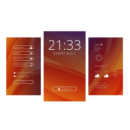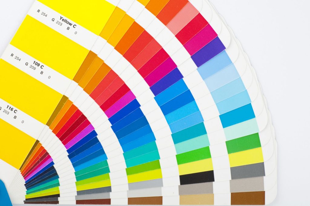
The power of color is never overstated in the design field. It captures feelings, provides a backdrop and speaks volumes without uttering a single word. This makes color a core aspect in any UI design. Furthermore, color within digital interfaces is not only cosmetic; it affects the user’s actions, organizes layouts, and improves consistency and efficiency. Such principles are essential for UI designers, as they employ color in their designs to create harmony with the needs of the users and help achieve the goals of the product. This article will discuss the fundamentals of color theory and its relevance to modern interface design, making it easier for you to effectively appeal to your target audience.
Understanding Color Theory
The foundations of color theory depend on the color wheel, which can be defined as a circular arrangement of the primary colors red, yellow, and blue and their secondary and tertiary colors. The latter are green, orange, and purple and further mixing gives yellow-green, blue-green, etc. or tertiary colors which are also known as red-orange, red violet. Complementary colors are those which are positioned directly across from each other on the wheel while analogous colors are those which are next to one another and help to tie the more dominant colors together. The use of Z/UI design is intended to facilitate the organization and flow of different components on the interface by manipulating the color scheme of various components in a patterned way.
The Role of Warm and Cool Colors in UI Design


Colors are typically categorized as either warm or cool. Warm colors are reds, oranges, and yellows. Cool colors encompass blues, greens, and purples. Warm colors can evoke energetic emotions, urgency, or getting attention and, therefore, must be reserved for calls to action, buttons, and messages of error. Cool colors, on the other hand, feel calming and generally convey stability and trust, making them good backgrounds and informational content. For instance, a health or financial application would want to look and feel reliable by using shades of blue, while an ordering-for-delivery application may use red or yellow tones to stimulate appetite and activity. Understanding the emotional associations warm and cool colors can evoke enables designers to choose hues that appropriately align with the voice of a brand while enhancing the user’s overall experience.
The Power of Contrast and Readability
Contrast plays a crucial role in UI design, not only for aesthetic appeal but also for readability and accessibility. A good contrast ratio between text and background ensures that users can easily read information, especially for those with visual impairments. Dark text on a light background, or vice versa, often works best for readability. Beyond text, contrast can help highlight essential elements, such as buttons or notifications, making it easier for users to focus on calls to action or navigate the interface. Tools like contrast checkers can help designers ensure their color combinations meet accessibility standards, making the design usable for everyone.
Using Color Harmonies and Schemes in UI

Color schemes are the combination of colors based on specific relationships within the color wheel, and picking the right one is crucial to give your UI that look. The most common schemes include monochromatic. Analogous schemes involve colors next to each other on the color wheel and make for a natural, harmonious palette. Triadic schemes use three colors equidistant from each other to bring in vibrancy without becoming overwhelming. A proper color scheme, if chosen, effectively can match the look and feel of the UI with the intended purpose of the product and create an enjoyable, cohesive experience for its users.
Color Psychology in UI Design
Colors carry psychological meanings that can greatly influence user perceptions and behavior. For example, blue often conveys trust and professionalism, while green is associated with growth and tranquility, ideal for wellness or environmental brands. Red, being bold and attention-grabbing, can signify urgency and is frequently used for sale banners or alerts. These color associations aren’t universal but can be powerful in shaping user experience within specific cultural contexts. By using these subtleties, a designer who is aware of color psychology can quietly improve the brand’s messaging and establish an emotional bond with people that transcends practicality.
Accessibility and Color Choices
Inclusive design practices therefore encompass an understanding of color choices in relation to all users with varied visual abilities, including color blindness. Many people cannot tell well between colors such as red from green or blue from yellow. Relying on color alone, therefore, conveys information inaccessible to others. Because of this, designers should always employ colors in concert with other cues, such as icons or textual labels, so all users may effectively interpret the interface. In addition, high-contrast colors and testing of designs using accessibility tools play a great role in making the interface available to the largest number of people by supporting both usability and inclusivity.

Brand Identity and Consistency
Colors in UI design are part and parcel of branding. It helps to build an identity, which then is continued all through the ecosystem of the product. When users navigate through an app, a website, or just a product, seeing colors repeated, they start associating those colors with that brand, which builds recognition and then trust. A designer should work under a specified palette reflecting core values and tone of a brand. For example, a fitness application would use bright and energetic colors to echo the active and motivational nature of its branding, while a financial application would exhibit more muted tones as a means to establish a sense of trust. Consistent color usage helps not only with the enhancement of brand identity but also strengthens user experience to be increasingly polished and professional.
Conclusion
Mastery of color theory in UI design allows designers to create interfaces that are not only aesthetically appealing but also emotionally touching and functionally effective. Color influences the perception and interaction of users with a product, guiding them through actions, communicating information, and enhancing accessibility. By applying principles like choosing harmonious schemes, ensuring contrast, and considering color psychology, designers will be able to craft UIs that deeply resonate with users and support the product’s goals. As you work your way through colour in your designs, remember that every color decision has the potential to elevate or degrade the user’s experience; making color theory a great backbone to base effective UI design upon.
