In design, every element plays a role, but not all elements are meant to be noticed equally or simultaneously. Visual hierarchy is the principle that organizes these elements so users experience them in a logical and intuitive order. Whether we are interacting with a website, scrolling through a mobile app, or reading a poster, our eyes naturally follow a sequence that is determined by visual cues such as size, contrast, and alignment. An effective visual hierarchy ensures that the most critical information stands out first, followed by supporting details, allowing for an effortless user journey. In this blog, we’ll take a deep dive into the concept of visual hierarchy and its significance, principles, techniques, and how it impacts design decisions across different platforms.

Visual hierarchy refers to the deliberate structuring of elements within a design to control the order in which users notice and interact with them. It answers the question: What should the user see first, second, and last? By ranking the importance of each element like text, images, buttons, or icons, designers can help users process information efficiently. Without a clear hierarchy, users may feel overwhelmed or miss key actions, resulting in confusion or disengagement.
At its core, visual hierarchy uses a combination of visual weights and relationships. Certain elements are given higher prominence to indicate priority, while less important items receive less emphasis, subtly guiding users toward the desired outcome, such as clicking a button or reading a headline.
The Importance of Visual Hierarchy in Design
Visual hierarchy directly affects the usability, accessibility, and overall experience of a design.
- Enhances User Experience (UX)

Visual hierarchy is a fundamental element of the user experience because it helps structure information in a reasonably predictable and coherent manner. When a design demonstrates which information is the most critical at any given moment, users are less likely to become confused when looking for something specific. In turn, the quality of interactions increases, making the users’ satisfaction with the product higher. In other words, effective hierarchy in the design lowers the pain points experienced by the users in their journey, making the overall experience more fluid.
- Facilitates Decision-Making
A well-enforced visual hierarchy enhances user decision-making speed since they are channeled towards the most prominent information first. For instance, in an online shop viewing a product page, the user will see the product’s title, its price, and its ‘add to cart’ button before he looks at other details about the product. When the key parts of the order are placed in the top part of the hierarchy, the burden of decision-making processes for users tends to be reduced, hence accelerating the pace of decision-making and interaction of users with the design.
- Reduces Cognitive Load
It is better when an information design is more organized because at least a user will not be presented with too much information at once. Organizing a visual hierarchy helps in the content presentation as it gives an approximation of the amount of content a user can retain and present it to the user in portions. This decreases cognitive load – the amount of mental effort which is needed to interpret and respond to the information. Decreasing cognitive load helps to enhance the experience and also improves the possibility for the users to be actively engaged with the content or actions.
- Encourages Desired Actions
Naturally, a design will have a purpose, which can be convincing users to register, purchase an item, or fill out a certain form. Such goals are made easier to achieve by the use of size, color or placement of objects that stand out within the design. If users are focusing on the important parts of a design such as a “Sign Up” button, it increases the probability that an action would get completed. There is a soft touch to this which achieves the ends of the design, without trying too hard to sell to users since hierarchy dictates where the attention of viewers should be focused.
- Improves Accessibility
For visually impaired users and screen readers alike, clear hierarchy makes the bones of content easier to comprehend. Contrast, coupled with sensible sizing and spacing of elements, helps all types of users make sense of and navigate a design. Consistent hierarchy allows anyone, regardless of ability, to access information more easily, which does make a design more inclusive to a wide range of diverse users.
Core Principles of Visual Hierarchy
- Size and Scale
Larger elements will always draw more attention by default, so size is one of the most simple ways to cause a visual hierarchy. Headlines are usually larger than the body text, and primary buttons often appear more imposing compared to secondary ones. Variation in size makes sure that users will understand what is most important with just one glance.
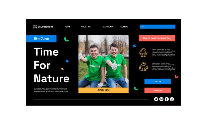
- Color and Contrast

Contrast makes elements obvious against others. For example, on a white background, a bright red button will be instantly picked up by the eye. On the other hand, low or mellow contrast elements can always hint at secondary information in design so that the main content takes the focus. Color psychology enhances this point even further by provoking an emotional response, such as blue to denote trust or green to denote action.
- Typography and Font Weight
Styling text can afford a design many layers of hierarchy. Text that is bold, italic, or underlined will be more apt to catch a reader’s eye than regular text. Variation in font size can indicate importance. Many designers approach content by organizing it with heading hierarchies: H1, H2, H3, etc.
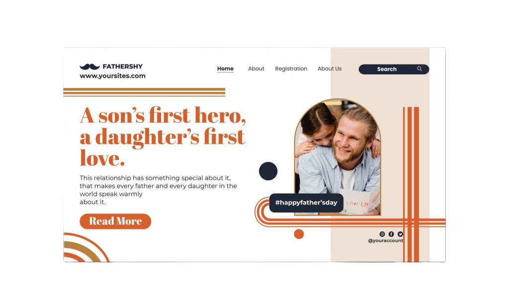
- Position and Alignment
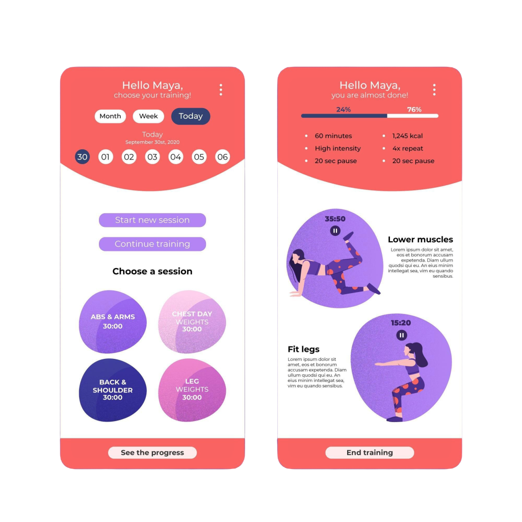
Placement affects the natural reading flow of a design. In Western cultures, users tend to read from left to right, top to bottom. This makes elements placed at the top or left side of a page more noticeable. Additionally, centered elements often carry more visual weight, especially in minimalist designs.
- Proximity and Grouping
Grouping related elements together makes it easier for users to understand the relationship between them. For example, placing a label directly above a form field helps users associate them as connected elements. Proper spacing also helps to separate unrelated content, improving clarity and reducing clutter.
- White Space (Negative Space)
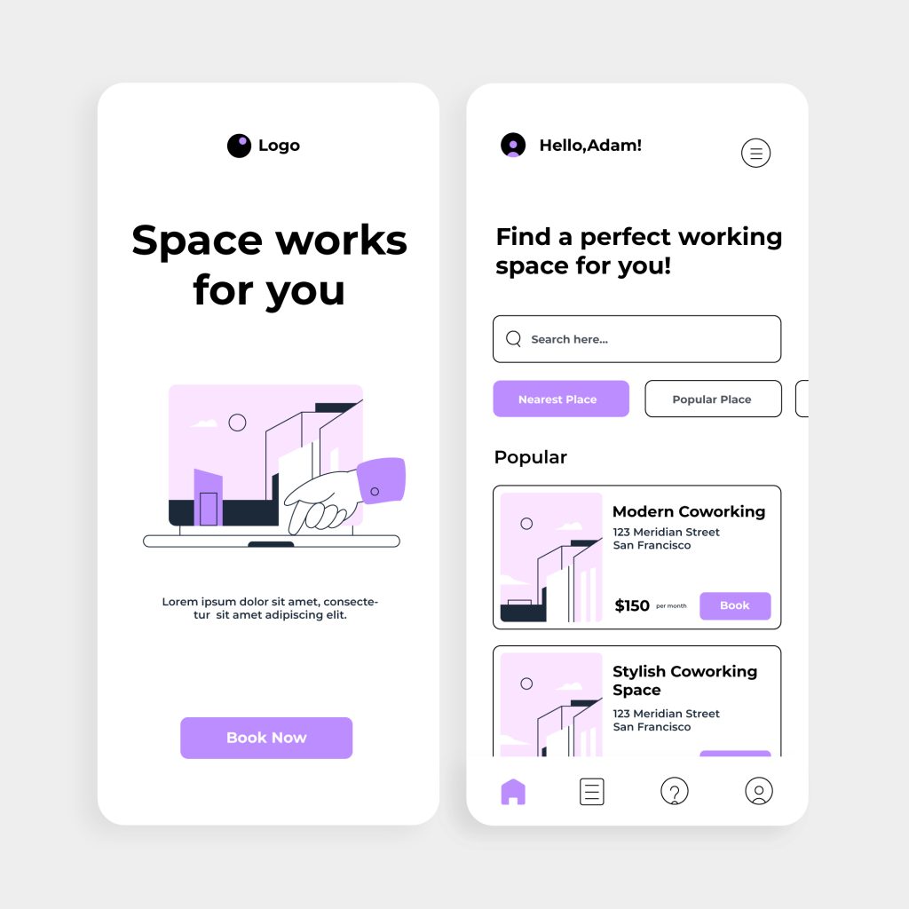
White space gives breathing room to elements, ensuring the design does not appear cramped. It allows users to focus on individual components without distraction, helping key elements stand out. A cluttered design with too little white space can overwhelm users and make it harder for them to find what they need.
How to Apply Visual Hierarchy in Practice?
It all begins with prioritization of the content by importance when it comes to applying visual hierarchy in design. First, the designers should select which elements-headlines, images, or buttons-are primary and make them stand out, making all other supportive elements subtle. Application of contrast is another key technique: for example, high-contrast color and bold fonts can make call-to-action buttons or important text pop, guiding users’ eyes right onto them. Following familiar design patterns, like navigation bars at the top or side menus, leverages natural expectations in users and enables them to interact with the design intuitively. Last but not least, usability testing is pure gold, being able to test real users and see if the hierarchy directs attention as intended, fine-tuning the design to improve navigation and overall user experience. The integration of such pragmatic techniques by designers allows them to come up with clear, accountable, and strong visual pathways that make the content engaging and lucid to comprehend.
Examples of Visual Hierarchy in Different Platforms
- E-commerce Websites
The user’s attention usually goes to product images, prices, and “Buy Now” buttons. Everything else is secondary information, which includes product descriptions or customer reviews, placed further below to make sure the user focuses on making the purchase decision ASAP.
- Mobile App Interfaces
In apps, primary actions like “Login” or “Sign Up” are highlighted using large buttons with bright colors, while less critical actions are placed in smaller text links. The compact space of mobile interfaces makes a strong visual hierarchy essential.
- Print and Poster Design
Posters often use large headlines and bold imagery to catch attention from a distance. Supporting text, such as event details, is placed further down or in smaller fonts, ensuring the core message is delivered first.
- News Websites
Headlines are given the highest prominence through size and bold typography. Supporting elements, like images and captions, help users decide whether to click on a story for more details.
Conclusion
Visual hierarchy is an essential design principle that transforms how users experience and interact with content. By guiding the user’s attention to important information first and organizing elements in an intuitive sequence, designers can create interfaces that feel both natural and engaging. Understanding the principles of size, contrast, typography, and spacing allows designers to communicate purposefully, making complex information feel accessible and enjoyable to explore. Whether on websites, mobile apps, or print materials, mastering visual hierarchy empowers designers to craft user experiences that are not only visually appealing but also efficient, leading to better user satisfaction, higher engagement, and stronger conversion rates. Ultimately, a well-thought-out hierarchy is key to a cohesive and impactful design.
