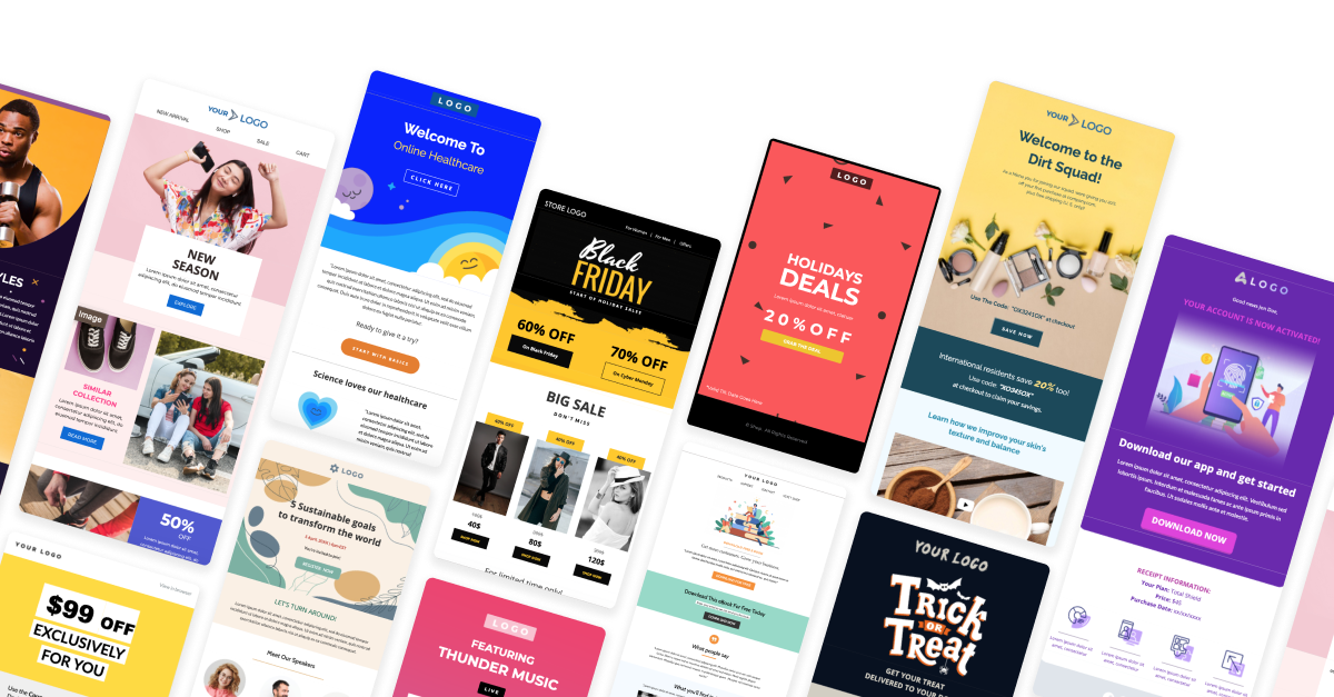
What is an Email Template?
Email Template designs are pre-structured layouts used to create consistent and visually appealing emails for various purposes. These templates are widely used for newsletters, promotional campaigns, transactional emails, and automated communications. Marketing teams, businesses, and organizations rely on them to maintain brand identity and streamline communication efforts. Email template design is crucial because it ensures efficiency, reinforces brand consistency, improves user experience, and enhances engagement across different email platforms.
Guidelines For Designing Email Templates
Keep it Simple with HTML and CSS Basics.
Email templates need to be compatible with a wide range of email clients, including older ones like Microsoft Outlook or the native Android mail app, which do not support advanced web features. As a result, it’s best to stick to basic HTML tags, such as <table>, <div>, <p>, and <img>, to structure content. Use inline CSS (e.g., <td style="padding: 10px;">) for styling, as many email clients strip out or ignore external or embedded CSS.
Advanced features from CSS3 and HTML5, such as animations, transitions, or modern layout techniques like flexbox and grid, are often not fully supported. Avoiding these ensures that your design remains intact across all clients. If your email needs interactive elements (e.g., buttons), it’s better to use links that lead to a website rather than relying on JavaScript, which is blocked by most email providers for security reasons.
Email template should be 600-800 pixels maximum width.
This ensures your template fits well on most devices and clients. Narrower designs work better for mobile responsiveness, but staying within this range maintains readability on larger screens.
Use Tables for Layout.
In email template design, tables are better for layout because they offer better support across a wide range of email clients, especially older ones like Microsoft Outlook, which struggle with modern CSS layouts like flexbox and grid. Tables allow you to precisely control the positioning and alignment of elements, ensuring that the design renders consistently.
Design for Responsiveness.
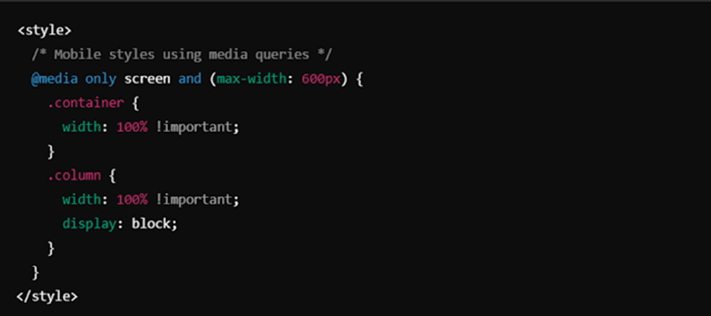
Use media queries for smaller screens to adjust font sizes, hide unnecessary content, and stack elements vertically. Use @media rules for targeting mobile devices.
Limit File Size to 100 KB.
Limiting email size to 100 KB ensures faster loading, better deliverability, and improved engagement by avoiding spam filters and Gmail’s clipping of messages over 102 KB. Smaller emails are optimized for mobile devices with limited bandwidth, consume less data, and display more consistently across various clients. They also reduce bounce rates from servers with size limits and enhance the user experience by minimizing slow loading times. To achieve this, compress images, use external hosting, avoid embedding videos, minimize custom fonts, limit background images, simplify design, reduce tracking pixels, and use web-safe fonts.
Font and Styling Considerations.
Fancy or imported fonts might not display as intended if they aren’t supported in some email clients (Gmail, Microsoft Outlook, Yahoo Mail, Apple Mail (Older Versions) etc.). Default to safe, widely supported fonts to maintain visual consistency.
Examples – Arial, Comic Sans MS, Courier New, Verdana, Georgia, Times New Roman
Use inline CSS for styling since many email clients ignore embedded or external styles. But when you are going to responsive your design, you can use internal CSS.
Optimize Images and URLs.
Always use absolute URLs (e.g., /images/logo.png) for images to ensure they load properly. Include meaningful ALT tags as some clients block images by default.
Consider light and dark theme support.
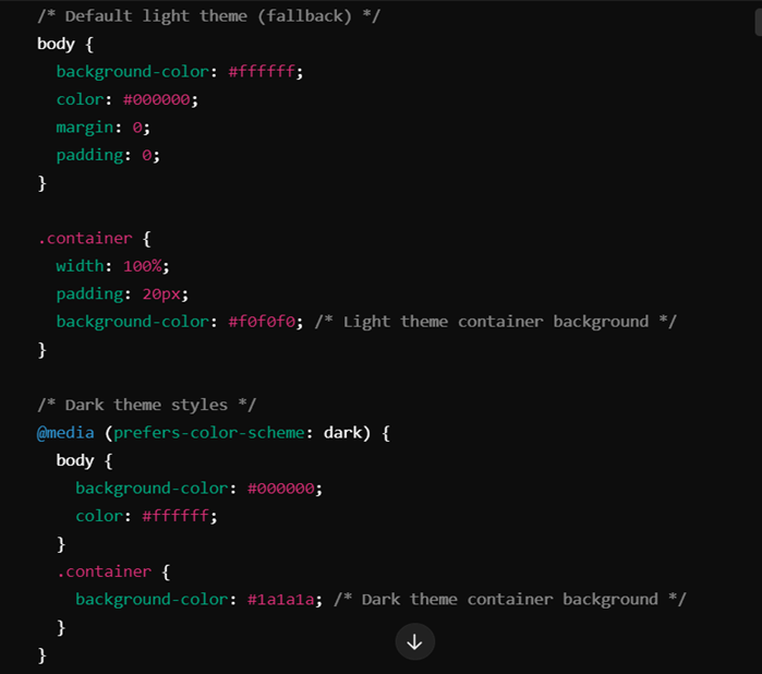
Ensure your email template works in both light and dark modes by using CSS variables or @media (prefers-color-scheme) to optimize the design for dark mode. While some email clients, like Apple Mail, Gmail Desktop, AOL, and Yahoo Mail, allow switching to dark mode, it does not alter how the HTML email is displayed, meaning the content will appear the same regardless of the mode.
Example:
Security Limitations
Many email clients block JavaScript and embedded forms for security reasons to prevent phishing attacks or malicious activities. Instead of adding forms directly within the email, use buttons or clickable links that direct users to external landing pages where they can fill out forms safely. This approach ensures compliance with email security policies while maintaining interactivity. Similarly, avoid using scripts and dynamic content, as they may not only be stripped out by clients like Gmail and Outlook but could also cause parts of the email to break.
Testing Across Clients
Email templates often render differently across platforms, so it’s essential to test the design across multiple clients and devices (such as Gmail, Outlook, Apple Mail, and Yahoo). Each client handles CSS and HTML differently, meaning that some design elements may not appear as intended. Tools like Litmus or Email on Acid can help simulate these environments, enabling you to catch and fix compatibility issues early. Testing ensures that your email displays consistently and functions well, regardless of the recipient’s email client or device.
What are the Not Applicable Things on Email Templates?

When designing email templates, some web development techniques and features may not be fully supported or behave inconsistently across different email clients. To ensure a smooth and reliable user experience, it’s important to be mindful of these limitations. The table below outlines common features that may not work as expected in email templates, along with suggested alternatives to help maintain compatibility.
| Not Applicable Things | Alternative Solution |
| JavaScript functions do not work in email templates. | Use basic HTML and CSS. |
| Using minus values for margin or padding is often not supported. | Use alternative layout techniques without relying on negative values. |
| Setting positions like top:0; bottom:0; doesn’t work for images inside a table. | Wrap the image in a div, and apply background images using url() for better control. |
| Some Google Fonts fail to render in email clients. | Add the text as an image or always try to use basic, cross-platform fonts(Arial, Comic Sans MS, Courier, Verdana, Georgia, Times New Roman etc.). |
| Internal CSS color variables (e.g., –main-color) may not work in email clients. | Set the color directly instead of using CSS variables. |
| background: linear-gradient doesn’t work without content. | Add content or an invisible element like a spacer to display the gradient. |
| Image Filters (e.g., filter: invert (100%)) are often unsupported in email clients. | Use external tools like Photoshop to apply filters to the image, then upload the processed image. |
| Drop shadows are not working on email templates. | Use images or you can add a border with low transparency. |
| Some email clients do not support SVG image files. | Use other image formats such as PNG, JPEG or GIF. |
| Internal CSS colors rooting didn’t work on email templates. | Set the color values directly instead of using CSS root variables for colors. |
| The transform property is not supported in many email clients. | Avoid using CSS transformations in email templates. Use static elements or pre-adjust images instead. |
| Avoid using CSS transformations in email templates. Use static elements or pre-adjust images instead. | Use table-based layouts for structuring elements, as tables are more widely supported in email clients. |
Different Email Clients and Their Unique Guidelines
Gmail (Web & Mobile)

Gmail supports basic HTML and CSS, but it has some limitations. It blocks CSS animations and forms, making it necessary to avoid interactive elements within emails. While media queries are supported in the Gmail app, they aren’t fully supported on webmail, which may affect responsiveness. Additionally, Gmail removes any content styled with display: none, so avoid hiding elements this way. For responsive designs, it’s better to use max-width rather than fixed widths, as Gmail sometimes struggles with the latter. Background images may not render in webmail, so it’s advisable to use solid background colors as a fallback.
Outlook (Desktop & Web)

Outlook, especially the desktop version, has poor CSS support and often strips out padding, margins, and floats. To ensure consistent rendering, it is recommended to use tables for layout. Additionally, background images are not supported on the desktop version, so using fallback background colors is essential. Outlook.com offers better CSS compatibility, but forms and transitions are still restricted. Developers often use MSO conditional comments to apply specific CSS fixes targeted at Outlook.
Apple Mail (Mac & iOS)

Media queries and sophisticated layouts like flexbox and grid are supported by Apple Mail’s extensive CSS support. It efficiently manages embedded fonts, which are blocked by many other clients. To guarantee clarity, high-resolution photographs must be used on devices with high pixel densities. While Apple Mail does support contemporary CSS effects like shadows, it is recommended to use them sparingly because overusing them might lead to performance problems.
Yahoo Mail
Since external CSS is not supported by Yahoo Mail, all styles must be inlined to guarantee consistent display. Although media queries are enabled, using straightforward, fluid layouts will increase responsiveness and be safer. Although backdrop images are usually accepted, in previous versions they might not render correctly. Additionally, Yahoo does not support many sophisticated CSS features, like transitions and animations, thus for consistent performance, simpler designs are advised.
Outlook for Mac
Outlook for Mac features superior CSS support and media query rendering capabilities as compared to the Windows version. Moreover, compared to its Windows counterpart, it manages background graphics and embedded fonts more consistently. Email templates should still be thoroughly tested, though, as there might still be some differences between the Mac and Windows versions.
Thunderbird

Thunderbird offers strong support for modern HTML and CSS, making it a reliable client for email templates. However, it is recommended to avoid embedded forms to ensure full compatibility. Inline CSS is preferred to prevent any unexpected rendering issues, although Thunderbird generally handles most styles well.
AOL Mail

Similar to Yahoo Mail, AOL Mail requires inline CSS for uniformity in behavior. Use solid colors or simple designs instead of background graphics, as they might not render correctly in all situations. It is advisable to stick to straightforward and useful designs because, similar to Yahoo, AOL supports few complex CSS features like gradients and shadows.
ProtonMail
ProtonMail removes most external CSS, so inlining all styles is necessary to maintain design integrity. JavaScript and complex CSS features are not supported, making it essential to stick with basic HTML and CSS. To avoid any rendering issues, it’s also recommended to use simple layouts and avoid using external fonts.
Zoho Mail

Zoho Mail requires all CSS to be inlined for proper rendering. Advanced features like JavaScript and CSS animations are not supported, so interactivity should be limited to buttons linking to external pages. Although background images usually render nicely, it is nevertheless advisable to test them on various devices to guarantee consistency.
Conclusion
Designing email templates is both an art and a science, requiring a balance between creativity and technical precision. By embracing simplicity in HTML and CSS, leveraging tables for layout, and ensuring responsiveness across devices, businesses can create emails that are not only visually appealing but also highly functional. Managing security limitations by avoiding JavaScript and embedding interactivity through external links helps maintain user trust and ensures smooth delivery.
Testing templates across multiple email clients is essential to catch rendering issues and guarantee consistency, while optimizing for both light and dark modes enhances accessibility. Keeping emails lightweight with a size under 100 KB improves loading times, prevents clipping, and ensures compatibility across all platforms.
In the end, thoughtful email design goes beyond aesthetics it ensures every message looks professional, aligns with brand identity, and offers a seamless experience to engage audiences effectively, no matter the platform or device.
