Email marketing continues to be one of the most powerful ways for businesses to communicate with their audience. A well-designed email template is essential for grabbing the reader’s attention and delivering the message effectively. Unlike plain text emails, templates provide visual elements and structure to make the email engaging and easy to navigate. However, the design of a good email template is not a simple task; it requires a blend of creativity, strategy, and technical know-how. A designer must consider several factors, such as the purpose of the email, audience preferences, brand alignment, and even how different email clients render content. Moreover, it’s crucial to ensure that the design performs well across all devices, is accessible to a diverse audience, and complies with spam regulations.
In this blog, we will explore the essential factors that contribute to creating a successful email template. These factors not only help make emails visually appealing but also ensure that the intended message reaches the audience in the best possible way for boosting engagement and driving actions that align with the business goals.
Purpose and Goal Alignment
The foundation of a good email template begins with understanding its purpose and aligning the design with specific goals, such as promoting a new product, nurturing leads through newsletters, or confirming a user’s registration. For example, marketing emails emphasize CTA(Call-to-Action) s and use eye-catching visuals to drive sales, while newsletters focus on providing valuable information with minimal distractions. Without clear objectives, the email can appear cluttered, confusing, or irrelevant to the reader.
Target Audience and Personalization

Knowing your audience allows you to design emails that resonate with their interests and preferences. Templates targeted at professionals may require a formal tone, while emails aimed at younger audiences may use vibrant colors and casual language. Personalization plays a critical role in improving engagement. Including the recipient’s name or addressing their past purchases adds a personal touch that can increase click-through rates. Dynamic content, such as personalized product recommendations, takes this a step further, making each recipient feel that the email was crafted specifically for them.
Maintaining Brand Consistency
Over time, trust and familiarity are built through brand identity reinforced by a consistent design across emails. This entails adhering to the same style rules, color schemes, fonts, and logos as other platforms for brand communication, like social media and websites. Recipients are more likely to open and interact with an email if they can quickly recognize the brand. Additionally, consistency lowers the likelihood that the email will be disregarded or marked as spam by ensuring that it is viewed as legitimate and professional.
Structuring Content with Visual Hierarchy
A well-organized content structure ensures that the reader can quickly scan the email and find relevant information. Visual hierarchy involves prioritizing key elements, such as placing headlines and CTAs at the top or in bold. Dividing the email into sections with subheadings, bullet points, or images helps guide the reader’s attention naturally. Strategic use of white space is essential because it prevents overcrowding and allows each section to stand out. A clutter-free layout not only improves readability but also ensures that users focus on the primary message without getting overwhelmed.
Responsive and Mobile-Friendly Design

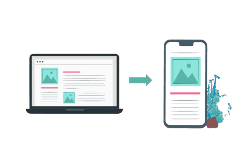
With most users checking emails on smartphones, creating a mobile-friendly template is essential. Responsive design ensures that the email layout adapts seamlessly to different screen sizes, whether viewed on desktops, tablets, or phones. A single-column layout works best for smaller screens, preventing the need for horizontal scrolling. Fonts should be large enough for easy reading (typically 14-16px), and buttons should have ample padding (at least 44x44px) to be clickable with a finger.
Images should scale fluidly to fit the screen without distortion, and concise content should ensure that the main message and CTAs are visible without excessive scrolling. It’s also important to test templates across devices and email clients to ensure the design remains consistent and functional.
Design Elements and Layout Choices
The layout of an email template plays a crucial role in how users engage with the content. A clean, minimalistic design ensures the message is easy to understand, preventing cognitive overload. It’s important to divide the email into distinct sections with headers, sub headers, images, and concise text blocks. This structure helps guide the reader’s eye smoothly from one section to another. Strategic use of white space improves readability by preventing overcrowding, giving each element room to breathe.
Videos and heavy animations are best avoided directly in emails, as they can slow down loading, using clickable thumbnails linked to external content is a better approach.
Optimizing Colors and Typography
Colors play a significant role in setting the tone and evoking emotions in an email. The choice of colors should align with the brand’s identity while also reinforcing the message. For instance, warm colors like red and orange create urgency, while cool tones like blue and green evoke trust and calmness. Using contrasting colors ensures that important elements, such as headers and buttons, stand out against the background, enhancing readability. However, it’s essential to maintain a balanced color palette to avoid overwhelming the reader.
Typography is equally important in ensuring the content is readable and visually appealing. Designers should use web-safe fonts like Arial, Verdana, or Times New Roman to ensure compatibility across different email clients. Font sizes should be appropriate for the device, usually 14-16px for body text and larger for headings. Proper line spacing improves the readability of longer text blocks, while limiting the variety of fonts keeps the design consistent and professional. By carefully selecting colors and typography, designers can enhance the visual appeal of the email without sacrificing clarity.
Accessibility Considerations
Accessibility ensures that emails are usable by everyone, including people with disabilities. Following accessibility guidelines like WCAG (Web Content Accessibility Guidelines) improves inclusiveness. WCAG provides a set of recommendations to make digital content, including emails, accessible to people with visual, auditory, physical, and cognitive impairments. These guidelines focus on four principles: content should be perceivable, operable, understandable, and robust across various devices and assistive technologies.
This involves using semantic HTML (like heading tags and lists) to structure content properly, ensuring it can be read accurately by screen readers. Designers should also provide meaningful alt text for images, ensuring the message is conveyed even if the image doesn’t load. Additionally, using descriptive links (e.g., “Explore our new collection” instead of “Click here”) helps users understand where the link leads. Accessible design not only broadens the audience reach but also reflects the company’s commitment to diversity and inclusion, making the content usable for everyone.
Email Client Compatibility

Email clients like Gmail, Outlook, Apple Mail, and Yahoo display emails differently because they interpret HTML and CSS in their own ways. Some clients, such as Outlook, have limited support for modern CSS styles, which can cause design inconsistencies. To ensure the template renders correctly across all platforms, designers need to use simple, well-tested HTML and avoid relying on complex CSS or JavaScript.
It’s essential to test the email across multiple clients and devices using tools like Litmus or Email on Acid. This allows designers to spot any issues early, such as misaligned content or broken images, and make adjustments. By understanding the limitations of various email clients and following best practices, businesses can ensure that their emails look professional and function well for all recipients.
Performance Optimization
Monitoring the performance of email campaigns is essential for understanding their effectiveness and making improvements. Key metrics such as open rates, click-through rates (CTR), bounce rates, and unsubscribe rates offer insights into how recipients interact with emails. Analyzing these metrics helps identify what resonates with the audience and what needs adjustment, such as subject lines, content, or sending times.
Advanced tools like Google Analytics or email marketing platforms provide deeper insights by tracking user behavior after interacting with the email, such as visits to a website or conversions. By regularly reviewing performance data, businesses can refine their strategies, enhance engagement, and achieve better results over time.
Anti-Spam Practices
Following anti-spam practices ensures that emails reach recipients’ inboxes instead of being flagged as spam. This involves adhering to email regulations such as the CAN-SPAM Act or GDPR, which require businesses to include an unsubscribe option and avoid misleading subject lines. Sending emails only to recipients who have explicitly opted in also helps maintain good sender reputation and ensures compliance with legal standards.
Additionally, technical measures like authentication protocols (e.g., SPF, DKIM, and DMARC) validate the sender’s identity, reducing the chances of emails being marked as spam. Maintaining clean email lists by regularly removing inactive or invalid addresses improves deliverability rates and reduces the risk of being blacklisted by email providers.
Testing and Continuous Improvement
Designing an email template is an ongoing process that requires continuous testing to ensure it stays relevant and effective. Small changes, such as modifying the subject line, adjusting the color scheme, or reorganizing content, can significantly impact how recipients engage with the email. Testing different variations helps identify which design choices and content resonate better with the audience.
Monitoring key metrics, such as open rates, click-through rates (CTR), and conversions, provides valuable insights into the email’s performance. If engagement improves after a change, it indicates that the adjustment was effective. This iterative process ensures that the email templates evolve over time, adapting to shifts in audience behavior and industry trends, ultimately leading to better engagement and results.
Conclusion
Creating a high-performing email template involves more than just attractive visuals. It requires balancing aesthetics with functionality, ensuring compatibility across platforms, and meeting the needs of diverse audiences. By aligning the design with the email’s purpose, maintaining brand consistency, and optimizing for mobile and desktop devices, businesses can create templates that stand out in crowded inboxes. Incorporating accessibility, personalization, and performance optimization further enhances the user experience, leading to better engagement and conversions. Through continuous testing and improvement, email templates can evolve to meet new challenges, becoming a powerful tool for building relationships and achieving business objectives.
